
For this lesson task we had to pick three websites, one for a non-profit organisation, one for a retailer and one for a service provider and answer the same questions about each of them.
NON-PROFIT ORGANIZATION
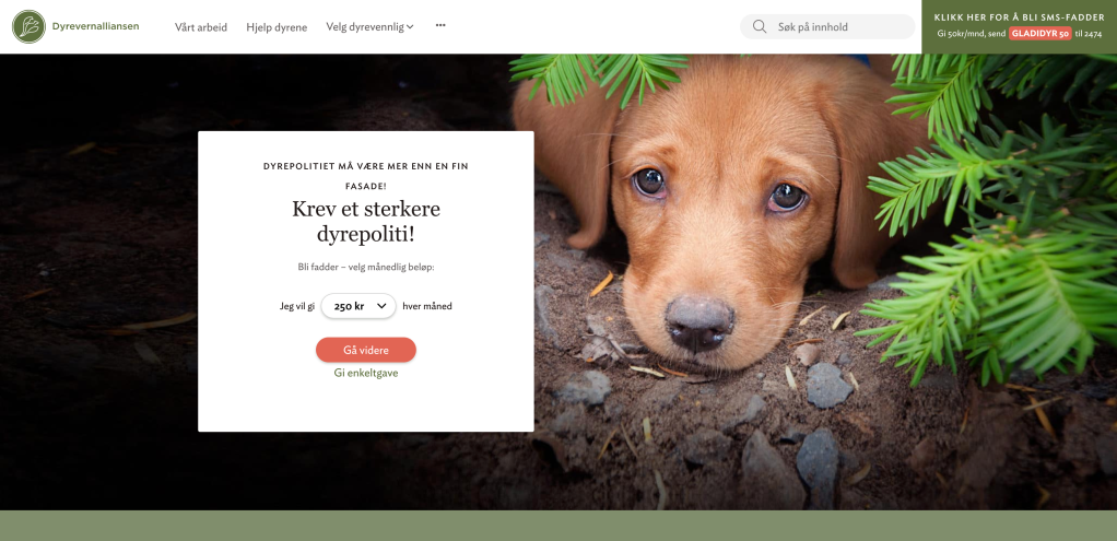
As the non-profit organisation I chose Dyrevernalliansen, an animal charity foundation (dyrevern.no).
The main goal of the website:
I think the main goal of the website is to give information about the organization and their work, which eventually can lead to people enlisting or donate money.
Elements in the design that are helping the users meet the website’s goal:
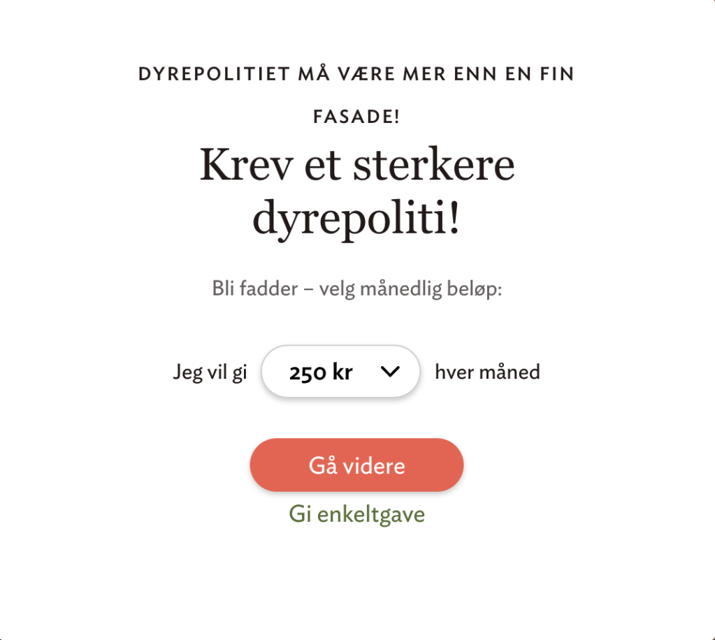
Already on their home page, there are two different call-to-action buttons that encourages the visitor to donate money to their organization. The first button of the navigation bar is a link to a page where the visitor can read more about their work.
Main target audience:
I think the main target audience of the website is everyone who cares about animals and their welfare.
How the design is used to attract this group of people:
The main design element that is used to attract the target audience is a heavy use of photos that will appeal to the visitor’s concern for animals. These images are the main focus on the website. Earth colors are also used for the website to give it a natural aesthetic that goes well with its content.
Brand and its overall brand image:
The website has a minimalistic and modern design that gives the impression of a serious brand, but with a light and friendly look. All the information you need is found on the site and all the functions and features are working well.
RETAILER
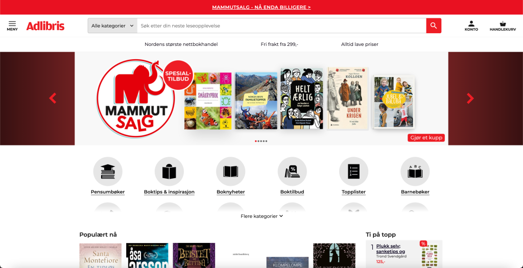
For the retailer I chose Adlibris, an online book store (adlibris.com).
The main goal of the website:
I think the main goal of the website is to give customers an easy way to browse through their products, which will make them sell books.
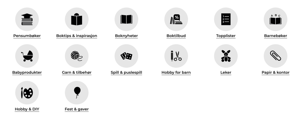
Elements in the design that are helping the users meet the website’s goal:
On their home page, there are a lot of different ways to navigate the site. There are buttons for different book categories, listings and sales, which makes it easy to browse through their product, based on the customers need. There is also a search bar at the top which makes it easy for the customer to go directly to the product they’re looking for.
Main target audience:
I think the main target audience of the website is people who read books or want to start reading.
How the design is used to attract this group of people:
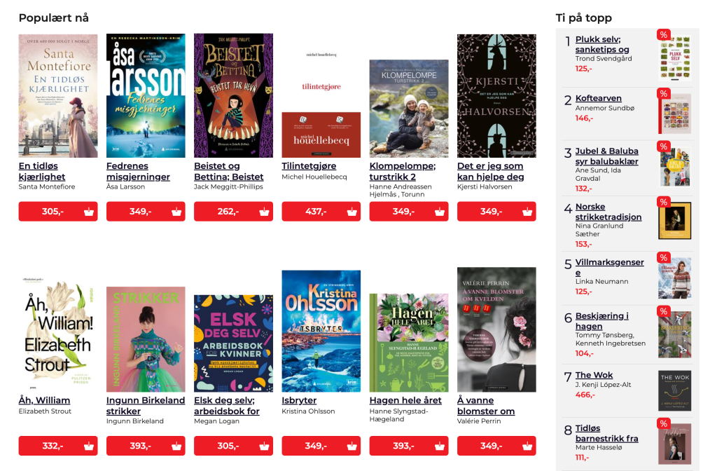
When you scroll down on the home page, the website is crowded with book recommendations and suggestions. There are top lists (“popular now”) and sales. All books are shown with an image of the front cover to attract the customer. This makes the browsing feel more like a physical book store.
Brand and its overall brand image:
A little more crowded design works well for this kind of website, where there are thousands and thousands of products to browse through. As with a physical book store, the big amount of products that are displayed at once can give the feeling of “treasure hunting” when scrolling through the site. The search function makes it easy to go directly to a specific product when this is preferred. There is a lot of information about each product, and the functions and features of the website are working well.
SERVICE PROVIDER
For the service provider I chose Vy, a Norwegian railway company (vy.no).
The main goal of the website:
I think the main goal of the website is to sell train tickets, and give the customers an easy way to find the information they need to use their services.
Elements in the design that are helping the users meet the website’s goal:
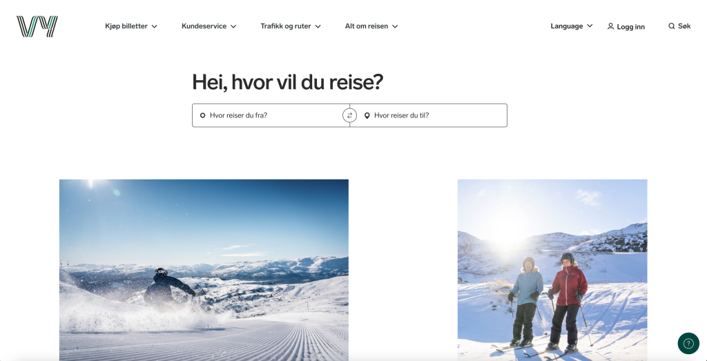
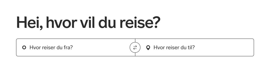
On their home page, the first thing that stands out is a box with the text “Where do you travel from?” and “Where are you going?”. This provides an instant and easy way for customers to start planning their journey and find tickets.
Main target audience:
I think the main target audience of the website has a very broad definition. It is definitely created with people of all ages in mind.
How the design is used to attract this group of people:
A contemporary design appeals to the younger generations. Easy, understandable and minimalistic design and large fonts makes the website user-friendly for older people with less technologic competence too.
Brand and its overall brand image:
The overall website design shows a professional and reliable company. All the information you need is found on the site and all the functions and features are working well. These are updated once in a while (a new feature of showing your journey on a map is recently added) to give the customer better overview and experience.