
This lesson task was about visual hierarchy on websites. We had to find an example and analyze how the website uses hierarchy to guide the viewer’s eye on the homepage.
For this task I chose to use the website of Download Festival (downloadfestival.co.uk).

On their home page, the first element that catches the visitors attention is the festival’s logo. This is both because of its size, its placement right in the center of the screen and because of the red color of the logo. I will argue that the viewers pattern is as follows: First the big logo in the middle, then the info below it, followed by the navigation bar at the top from left (the more simple logo) to the right (the countdown to the festival start).
Here is what I found to be the color palette used on the website:

White is used as the primary color, while black is mainly used as background. Cyan and orange are used as accent colors, while red is the primary color of the main logo, and is also used for some background elements.

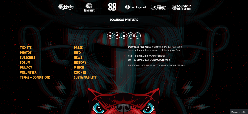
The fonts used are all sans-serifs. The H1 and Button fonts are all set in caps in a bold version of the font, while the body text is lowercased with thinner characters. All textual buttons/links are also given the orange color (which becomes white when hovering).
