
For this lesson task we had to design a packaging for a product called Easy Squeezy — a fruit juice with apple, grapefruit and pineapple flavour. To generate ideas for the label design, we were encouraged to draw at least 15 sketches/scamps. The concept should be finalised in Adobe Illustrator.
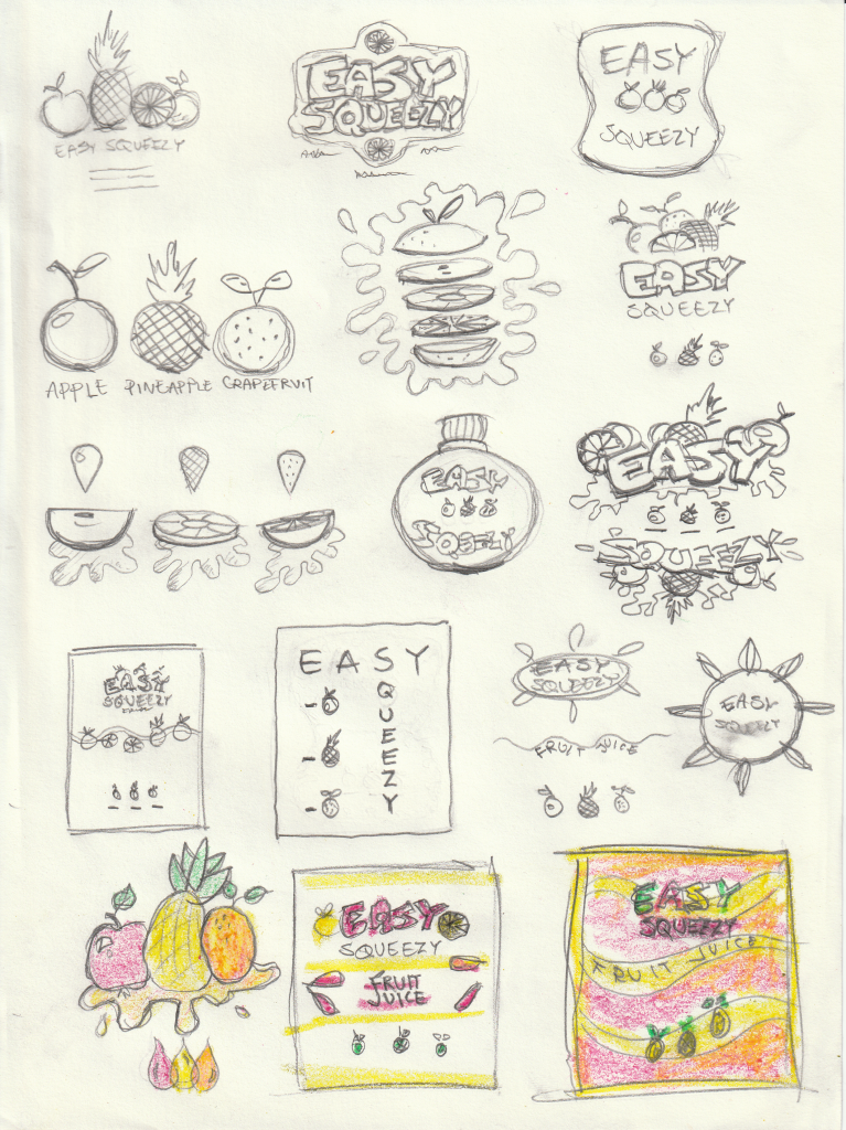
These are my scamps. To me, the product’s name, “Easy Squeezy”, requires a fun, colorful, cartoony design. That meant I had to use bright colors, some handwritten-looking, bold fonts, and having a lot of different graphic elements “squeezed” into the design. I knew early on that I wanted to include illustrations of the content that make up the product flavour, in addition to descriptive text naming the fruits.
Through the sketching process I figured that I wanted to put a logo with the product’s name on top, on the packaging’s upper third. To make it more interesting, I found it favorable to split the logo’s text into two different font-types. Furthermore, I wanted to add some kind of extra graphic to the main logo (in addition to the text). These should contribute to telling the customer what kind of product it is, without being the illustrations of the fruits; These I wanted placed on the bottom third of the packaging. The description of the content, namely “Fruit Juice” or simply “Juice”, would be placed in the middle.
Here’s a screenshot taken during the process of the design in Adobe Illustrator, with different versions of the main logo:
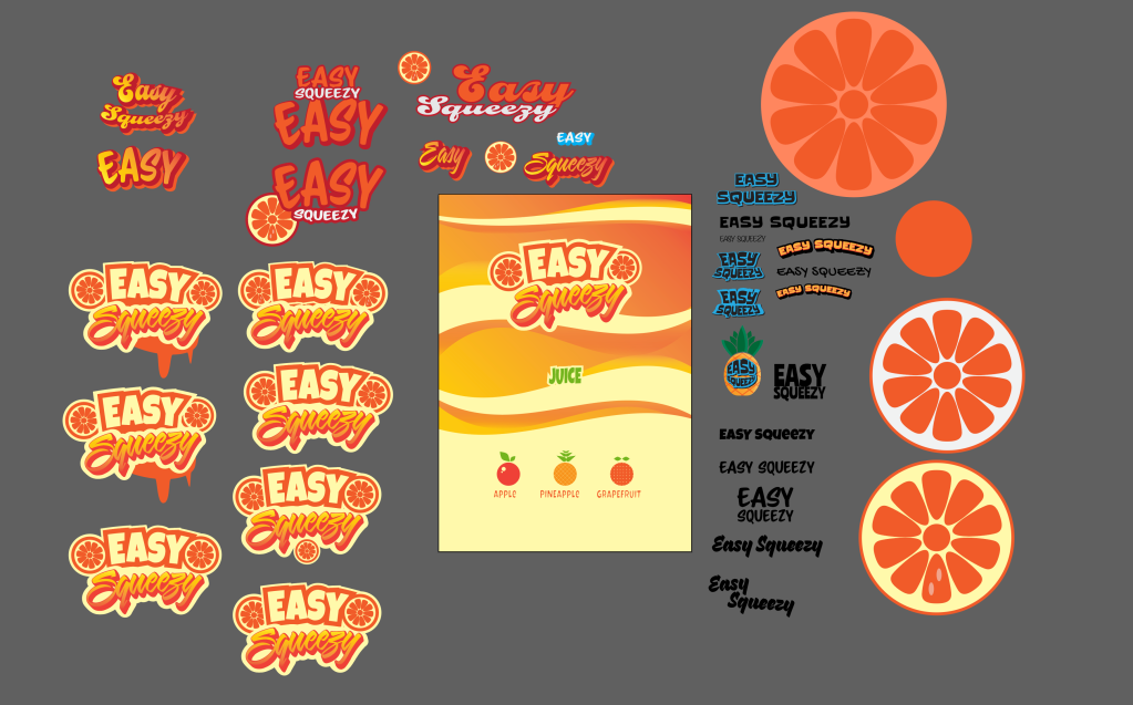
For the product’s logo I went for two different typefaces. The main text, I based on “Luckiest Guy”, which I found on Google Fonts. The secondary typeface, which I based the word “Squeezy” on, I got from Adobe Fonts. It’s called “Sarah Script”. As an attempt to implement the word “squeeze” into the design, I tried squeezing the text in different directions, and added some wavy shapes in the background.
In my final version I added different colors to the text. I also put some bubbles in the background to make it look more liquid. The illustrations of the fruits were kept simple and similar-looking, all three being based on the same shape.
