
This lesson task was about designing a poster for a fictional film festival, with the main focus on typographic layout.
POSTER
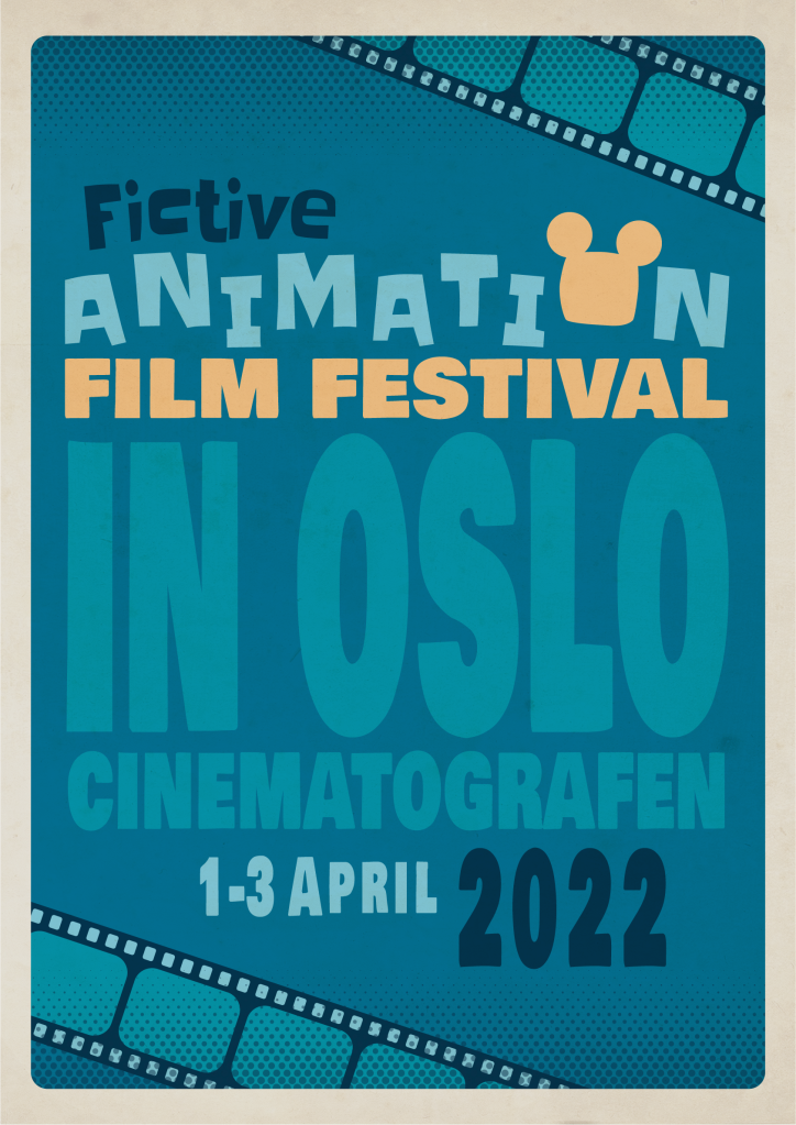
I wanted to make a poster for an animation film festival, with a 1950s/60s aesthetic. As the festival was to be fictional, the name I chose was “Fictive Animation Film Festival”, with the location being “Cinematografen”.
From my research I found that a lot of the old movie posters that had inspired me, oftentimes had a lot of different fonts and graphic elements scattered all over the composition — at seemingly random places. I wanted to implement this into my own poster design.
To achieve an aesthetic that would suit the genre of the festival, I had to use some cartoony fonts, with a bold, chunky appearance. For the main text — used to type out the festival’s name on the poster — I chose the typeface Slackey Regular. As a secondary font, I used Bowlby One. Both typefaces are found on Google Fonts. I thought they fit in well with the intended retro design.
For the word Animation, I found that by nudging every other letter up, it would look more lively and animated — and thus, amplifying the word’s meaning. It also made the word stand out from the rest. The “O” I made into a silhouette of Mickey Mouse — maybe the most recognizable character in animation. Sticking to the task’s objective of focusing mainly on typography, I only added one more graphic element to the composition, a film strip.
At last, to increase the retro look, I put some color halftone shading to the top and the bottom of the poster. I also added some texture to give it an “old” appearance.
This is the result, created with Adobe Illustrator:
PAMPHLET
As an extra task we had to create a pamphlet, based on the poster design, containing more information about the festival:

