The topic of this week was color theory. The lesson task was split into three “questions”: The first one was about color modes and color schemes. The second was about color effects, and in the last one we had to make a design for a book cover.
Question 1, Part 1 – RGB VS CMYK
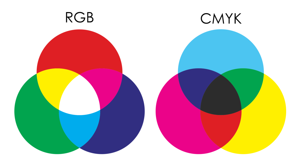
RGB and CMYK are different color systems or color modes. Which one to use depends on the medium you are using.
Source: https://trykk24.no/tips-og-triks/farger-rgb-cmyk-pantone/
CMYK
CMYK stands for Cyan, Magenta, Yellow and Key (Black) and is a subtractive color system. That means that you start off with white, and, by adding color, you move towards black: The more color you add, the more it’s subtracting from white, and the darker the color becomes. Theoretically, If the three primary colors (cyan, magenta and yellow) overlap, black will occur (in reality, a murky dark color).
The CMYK color system is used for printing, where the color you see is created from light reflecting from the material of a physical surface. White is usually represented by no color (on a white paper), while different colors are created from overlapping layers of cyan, magenta, yellow and black ink.
RGB
RGB stands for Red, Green and Blue and is an additive color system. Unlike CMYK, colors are not made from light reflected off a surface, but directly from colored light. You start off with black (no light), and the more color that is added, the lighter it gets. If the three additive primary colors (red, green and blue) overlap, it becomes white.
The RGB color mode is used for digital mediums such as computer monitors and televisions, where the colors are produced by a screen. To create color, every pixel on a screen is broken down into three sub-pixels, or tiny lamps. These three lamps each emits one of the additive primaries: One for red, one for green and one for blue. By varying intensity of each lamp (from 0 to 255), the light from each pixel on the screen can blend together into displaying millions of different colors.
The RGB mode also has a wider color spectre than the CMYK, which means that more colors can be created in the additive color system. Below is a visual representation of the range of the two color modes:
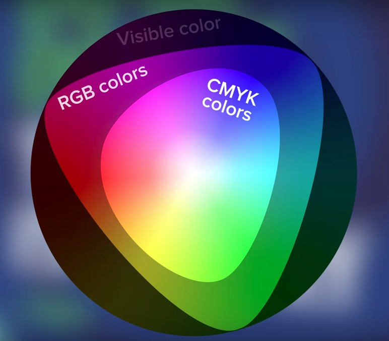
To sum up, the two color systems serve different purposes: The subtractive color system, CMYK, is used to generate colors for physical surfaces, like prints. The additive color system RGB is used to represent color directly from a light source, such as computer screens. They also have a different range of colors: Not all colors in the RPG spectre are available in the CMYK mode.
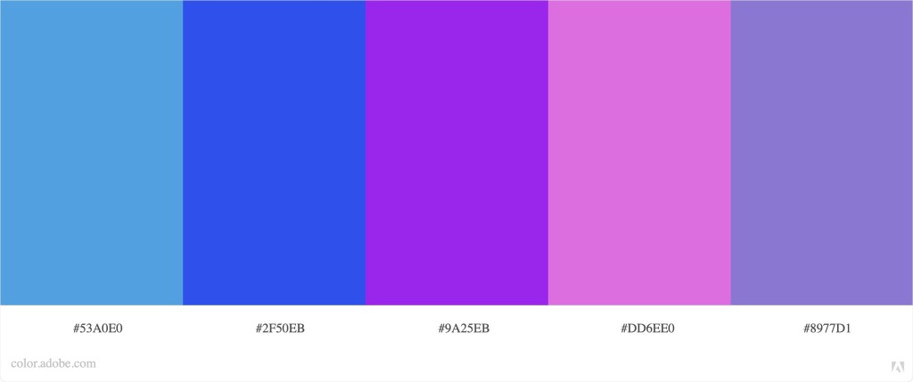
Question 1, Part 2 – Color Schemes
There are many ways to combine colors. Colors can vary in hue (the dominant color family), saturation (intensity) and value (shade and tint). In color theory there are some main formulas for creating color combinations that work well together, called color harmonies. These are four of them:
MONOCHROMATIC
A monochromatic color harmony consists of different colors that share the same hue. The colors used in a monochromatic color scheme only varies in value and saturation.
COMPLEMENTARY
Complementary colors are hues that are located directly opposite of each other on the color wheel. The use of a complementary color scheme creates strong contrast.

TETRAD
Tetradic color schemes consists of colors from two sets of complimentary harmonies (hues that are positioned opposite of each other on the color wheel). When picked on a color wheel, a line between the colors will make up a rectangular or square shape.
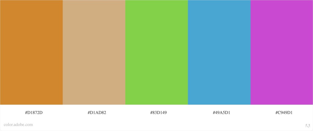
ANALOGOUS
Analogous color harmonies are made up of hues that lie next to each other on the color wheel.
Question 2 – Color Effects
In this task we were to apply four different color effects to a photograph of our choice, using Adobe Photoshop.
ORIGINAL IMAGE

FLOURESCENT DUOTONE
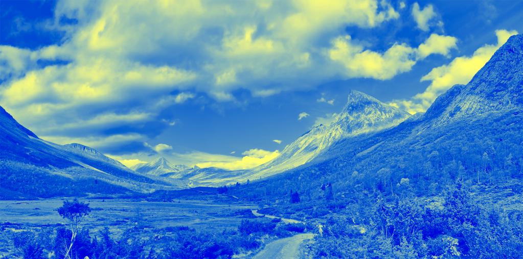
MONOCROMATIC
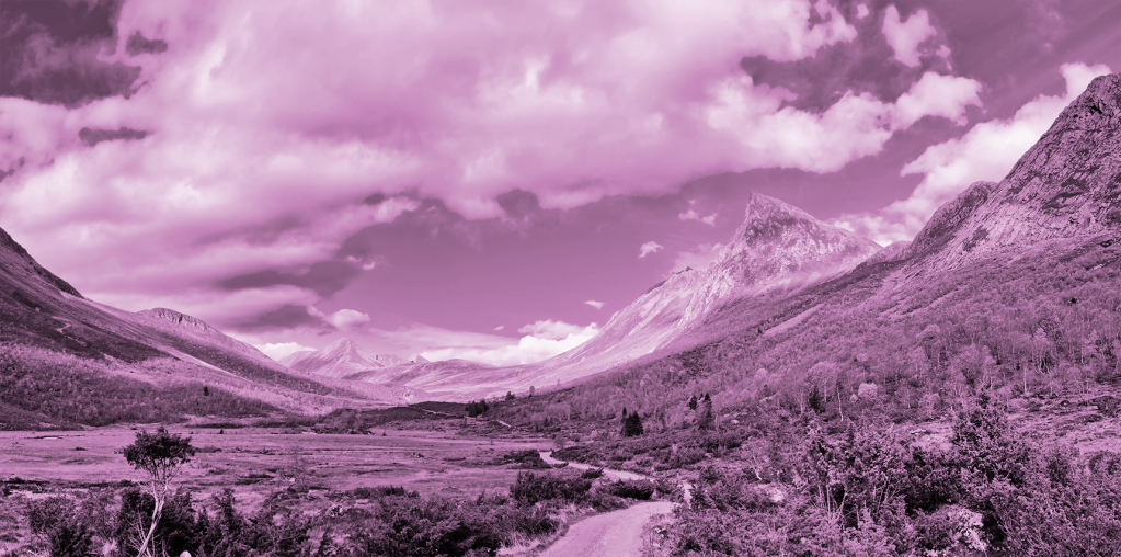
SPLIT TONING

FREESTYLE

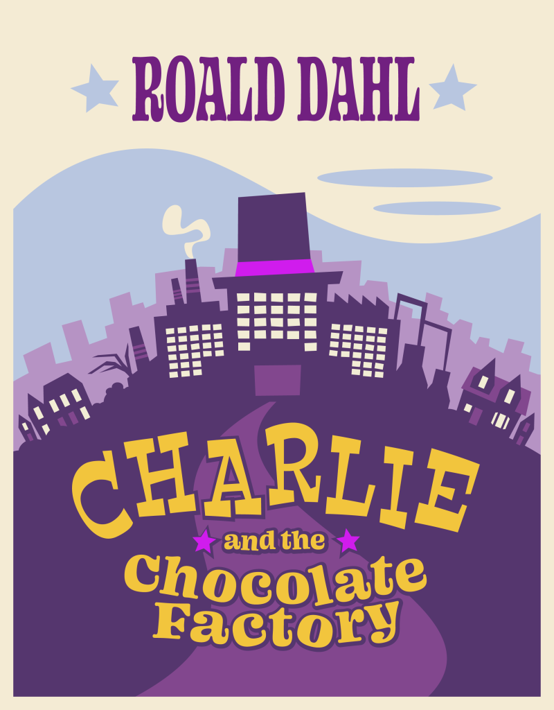
Question 3 – Book Cover
For the third and final part of this lesson task, we had to design a book cover. There were three titles to choose from. I decided to go for Roald Dahl’s Charlie and the Chocolate Factory.
Since this is a children’s book, I figured that I needed some bright, saturated and contrasting colors. I found that a split complementary color scheme would suit this purpose well. The palette I used was based on a purple, a blue and a yellow hue.
For the cover design I wanted to create an illustration that captured some central elements from the book. The factory acts as main ground for the story, and therefore, I wanted to include it into the cover art. I also added a shape that was meant to represent Willy Wonka’s hat on top of the factory, to give it some distinctiveness and to further link it to the story. To create some depth, I put the factory in front of a lighter, less saturated silhouette of a cityscape and a light blue sky.
I used a dark purple color for the main part of the composition. To create contrast between the illustration and the text, I used the bright yellow color on the title, which would be overlaying a more muted colored (purple) background. The most saturated colors were saved for elements that should stick out of the illustration: A bright violet was added to the hat shape on the factory, to make it a focal point. The same color were used for the tiny stars in the title, to link the text to the illustration.
Again, since this is a children’s book, I wanted to keep the illustration style, as well as the fonts, in a hand-drawn looking, childish aesthetic. The book was first published in 1964, so I based this on the style on 60’s cartoons.
This is the final result, created with Adobe Illustrator: