The objective of this lesson task was to analyze the layout of a print media by tracing the grid of the pages.
For this exercise I used the textbook Graphic Design School.

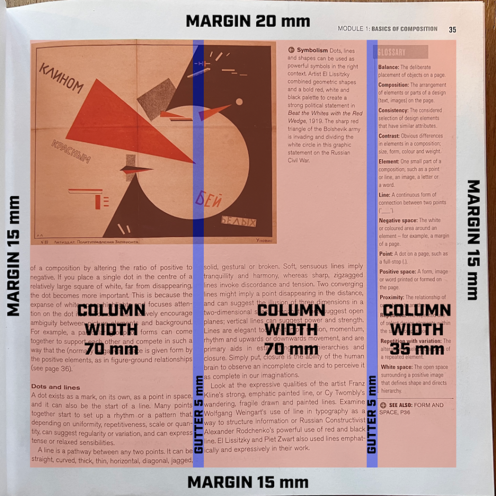
What I found to be the main layout rule used in this book was a three-column grid: Most pages were split into three columns of which two had a width of 70 mm each, and a third of 35 mm. The smallest column were usually put either to the far right or left of a page, and was saved for smaller images or explanatory text such as glossary, image captions or other info, while the two 70 mm columns were mainly used for body text. The gutter between each column was 5 mm. The pages had a margin of 20 mm at the top of the page, while the margins on the left, right and the bottom was 15 mm.

I repeated the exercise with a newspaper. Here, the layout of each page was equally divided into a five-column grid of 45 mm a column.