
This lesson task was about pace and contrast in layout design. We were to compare an online magazine, blog or website to a printed magazine, book or journal and look for differences in the design strategies.
For this exercise I’ve chosen to compare Digital Foto’s website to its printed magazine.

What I found, regarding pace and contrast, was that the printed magazine had a lot of contrast in terms of layout. Here, the images took up a considerable amount of the available space in each spread. Since the topic of the magazine is photography, it is very suitably to let the images be the main focus. This also works as a great way to quickly grab the readers attention.

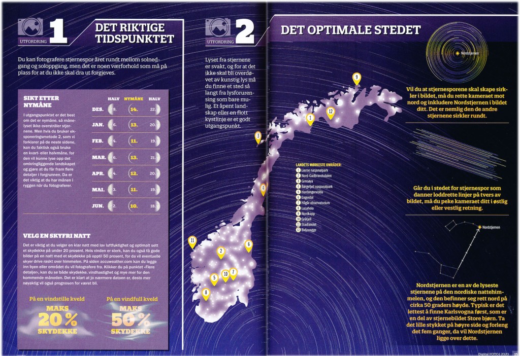


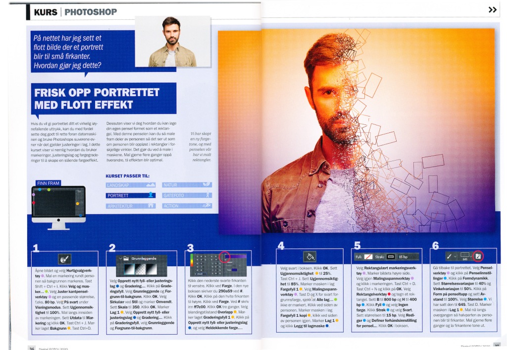

Because of the nature of the magazine — being a source of tips and tricks for photographers — it also requires a lot of informative text. Instead of having big chunks of continuous text put into equal sized columns and rows, it is split up into different “boxes” or panels of varying sizes, often directed towards some part of the illustrations with pointers or by mere placement. The text is also divided into different colors, fonts, font sizes and weights, to split up and vary the textual elements further and to guide the viewer. This makes the content less monotonous which, again, will make it more likely to maintain the reader’s interest. The spreads does also differ in it’s layouts and appearance, which creates a more interesting read.
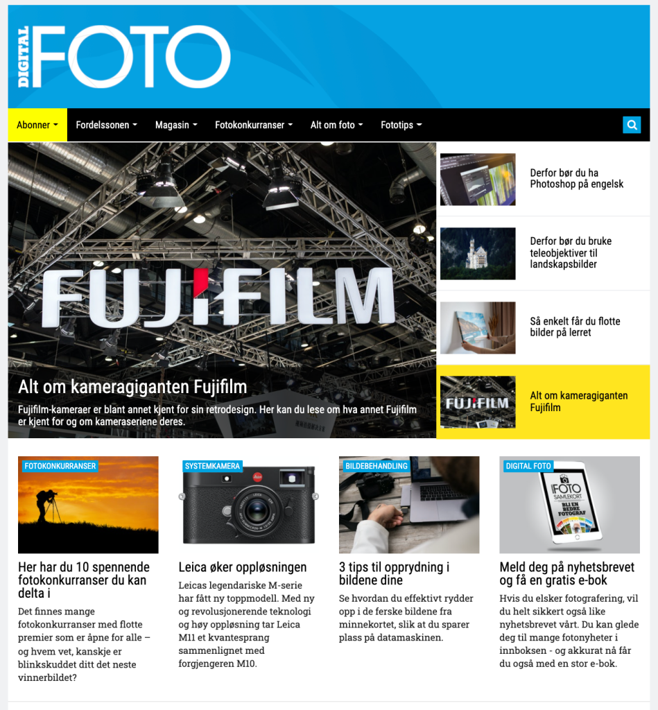
The website on the other hand, has a less contrasting and more predictable layout with a calmer pace. Much of the site’s content is laid out in pretty straight forward grid which is divided into columns and rows of equal widths and heights.
A reason for this could be that a website provides the possibility for the reader to interact with the elements seen on the page. This way, the main page doesn’t necessarily have to contain full articles. This allows for each element on the main page have shorter chunks of text as the reader can click on the element of interest to see and read more.
Another reason for the differing layout could be that, unlike the printed format, the website does not consist of spreads and pages, but of single, continuous pages for the reader to scroll up and down. In order to make it easy for the reader to navigate through the page, it may be favourable — and more important — for the website to have a more coherent structure with less contrast.